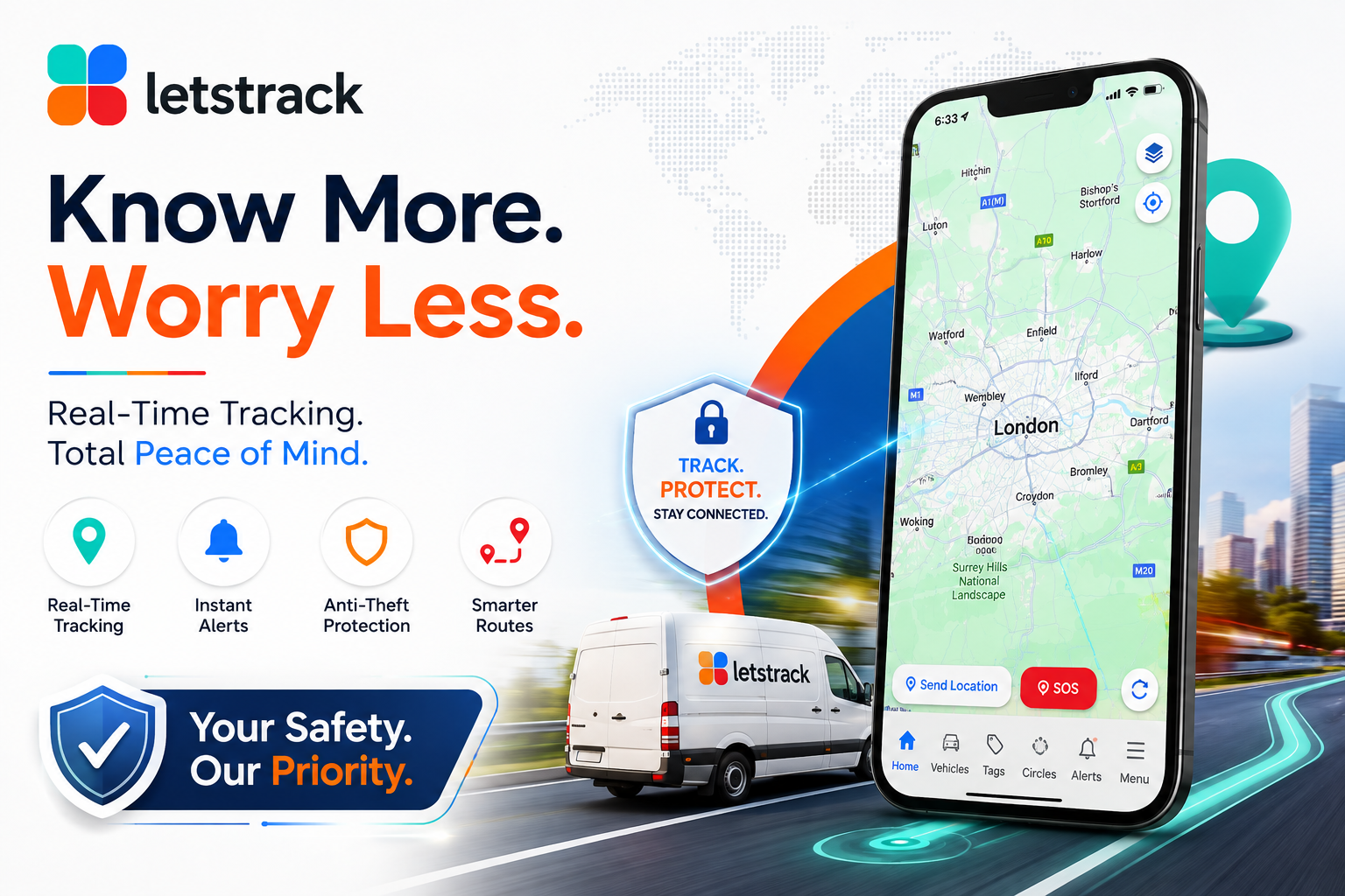


Open the dashboard, and it is all one map. A car. A dog. A parent. A bag. Each one turns up as an identical coloured pin, the same size, the same shape, sitting on the same grid. Looked at coldly, that is a fair criticism to make: a single interface flattening a person you love down to the same visual weight as a set of keys.
We do not think that criticism is wrong to raise. We just think the map is the wrong place to look for the answer.
A Map Cannot Hold Nuance, and Was Never Meant To
A map is a spatial tool. Its entire job is to answer one question well: where is this, right now? Trying to make a map also express something as layered as a relationship, a duty of care, or a difference between owning an object and loving a person would make it worse at the one job it actually has. So the pin stays simple on purpose. The nuance was always meant to live one layer underneath, in what happens the moment you actually tap on it.
Four Different Things Happen Behind Four Identical Pins
Mark a bag as lost, and mark a person's location as needing help, and the app runs a genuinely different sequence underneath each one, even though both started with the same size dot on the same screen.
Track live
A radar-style dashboard opens with running counts of active finders and shares for an object exactly the same as for a person.
Choose reach
The alert routes to the nearby community, partner venues, and auto-generated social posts. For a person's SOS, this reach can escalate far faster and wider than it ever would for a set of keys.
Add incentive
A visible cash reward gets attached, a mechanism that exists for lost items and pets, not for a person's SOS signal, which needs urgency, not a bounty.
Confirm facts
Last seen time, location, and last tag scan get pulled automatically, eliminating typing under stress, whether the stress is a missing dog or a missing person.
The pin never changes shape. What happens after you tap it?
Consent Is the Line, Not the Icon
The sharper, more honest difference between a person and an object was never going to be a bigger dot anyway. It is consent. A car does not agree to be tracked. A bag cannot opt out. A person, inside a Circle, has actively joined a shared group with people they trust and can leave it just as deliberately. That distinction does not show up as a different shape on a map. It shows up in who was asked and who said yes, long before any pin was ever placed.
Simplicity on the Surface, Judgement Underneath
A flat map and a single design language across every category are what make the whole ecosystem usable rather than overwhelming. Six different visual styles for six different categories would not make the app more respectful of the people in it; it would just make it harder to read at a glance, for everyone, including the people who matter most in it. The respect was never going to live in the pin. It lives in the consent behind the Circle, the urgency behind an SOS, and the restraint behind never letting a reward economy anywhere near a missing person. That is a harder thing to design well than a bigger icon, and it is the one that actually matters.